Module Preview
Module Preview
FAQ's
How To Use This Module
Allows you to provide prospects more flexibility in scheduling time to speak with a HubSpotter, rather than submitting a traditional form.
Use Cases
Guidelines
Variations
- Embedded: Meetings app appears within the content of the page
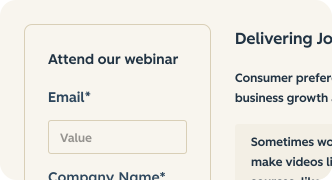
- Embedded (Card): Form is presented inside a card container (`cl-card`). Set "Form Appearance" to "Card" when "Display Type" is "On-Page Embed"
- Embedded (Text left): Set "Layout" (Experimental Features) to "Text left, form right" to show the title, tagline and description beside the form on tablet and larger screens
- Embedded (Image left): Set "Layout" (Experimental Features) to "Image left, text and form right" and add an image to show it beside the title and form. Without an image the module falls back to the stacked layout
- Modal: Meetings app appears within a modal, hidden behind a CTA to open the modal
Things to Know
- Modal ID (optional): when "Display Type" is "Modal", the modal ID is generated as `[module name]bookAMeeting`. Set "Modal ID" to use a fixed ID instead, so that Modal Trigger CTAs in other CSOL modules can open the modal. Use the same value as the CTA's "Modal Trigger ID" (e.g. `demo`); the `-modal` suffix is added automatically. It must be unique on the page.
- Option to enable the Reduced Field Form feature to display the form as a RFF. Important Note: The RFF will not work with all forms and form settings. Review the Form Requirements found on the RFF Wiki. For questions about the RFF, reach out on Slack in #mktg-reduced-field-form

What's New?
| v5.22.0 November 2026
- Added an Experimental Features group. These options may change or be removed at any time:
- Layout (visible when Display Type is "On-Page Embed") with Stacked (default), Text left and Image left arrangements. Side-by-side layouts stack below 900px
- Image field and Rounded image corners option, shown when Layout is "Image left, text and form right"
- Full viewport height toggle (On-Page Embed only), making the section at least 100vh tall with the content vertically centered
- Large (Display) heading toggle (On-Page Embed only), using the Component Library Display 02 type style
- Proof Points (up to 3 short claims with a check icon) shown below the form for On-Page Embed
| v5.21.0 September 2026
- Added Card form appearance option (visible when Display Type is "On-Page Embed") — wraps the form in a `cl-card` Component Library container
- Added Tagline field to both Owned and Unowned Contact groups
- Added Heading Size field (Standard / Small) to both contact groups — maps to `cl-h3` / `cl-h5` CL classes
- Renamed the Tagline field label to Description (field `name` unchanged for backwards compatibility)
| v2.26.0 May 2025
- This module has the option to enable Reduced Field Form